CHALLENGE
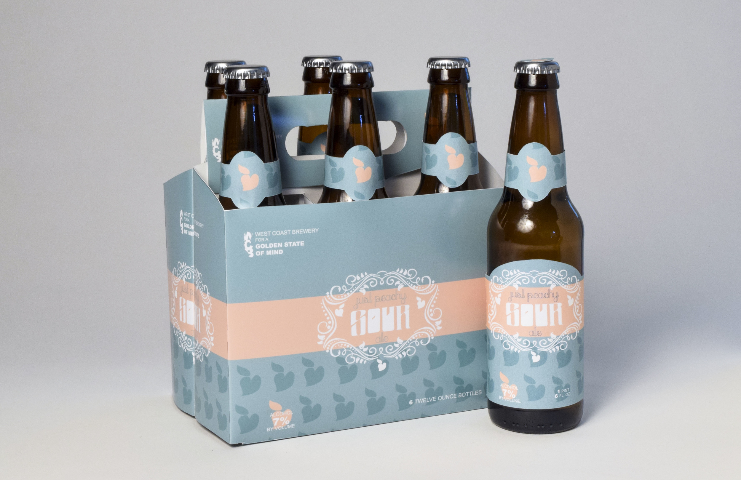
For this project, I designed a “beer type only” label and carrier for the company “West Cost Brewery”.
COLOR
I really wanted a simple design so I stuck with a minimalist palette, all pantones: a teal, peach and white for a fresh look that would reflect the properties of the peach sour I was creating.
DESIGN
I designed a signature peach that is featured throughout for visual interest that was consistent and therefore maintained the minimalist design. I created a filigree frame with subtle peaches throughout. The bottom of the carrier, as well as the side of the bottle describes a bit about the company and the brew, and is accompanied by social media icons converted into white to compliment the design.
TYPE
I took this opportunity to work on my typography and design my own typeface for the word “sour.” I also used a typeface, Peach Sundress, which has never fit into my design before.
IDENTITY
The identity design for the brand of West Coast Brewery also had to be attention grabbing, so I used the state of California as a clipping mask to create the coastline along the initials “WCB.” Once branding is established, this logo could stand on its own, but for the sake of clarity in this project, I included the title of the company and slogan I devised, “for golden state of mind.”


